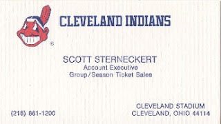
Cleveland Indians
Besides allowing people to keep track of old logos this card brings in a new twist. Looking down in the lower right hand corner you see that the team played in Cleveland Stadium. Doing a little research hoping that I can narrow things down on the cards time frame.. I learned that this business card has to be at it's newest from 1993. The reasoning behind this is the Indians played their last home game at Cleveland Stadium in 1993. A few years later in 1996 the stadium was demolished.
Keeping with the theme of the Indians cards. History once again tells us that the Indians played at Jacobs Field from 1994 until 2008. Then the stadium name was changed the Progressive Field which is the name it currently uses. Not only does it tell us these history things about the field. It tells me one more important thing that I never realized until now. I need to get an updated business card for the Indians.
Detroit Tigers
One of the coolest things about this look back into my MLB business cards has been all the old school logos. I have never sat down, and fully appreciated the cards in this collection until starting these posts. While I would give them a quick look over before putting them in the page. I never sat here, and appreciated the logos, and the little historic type information contained on some of these cards. Sadly their is only one more team who I have an old school logo for in the collection. It's a pretty cool one that lots of people will enjoy looking back at.
Detroit went from the old school to what I think are two good looking cards. The plain D with the two lines is a classy look that the Tigers did well. The D with the tiger, and stripes is another cool looking design. It helps that the tiger is my favorite animal. You would think keeping that in mind I'd be a Tigers fan, but no my loyalty stays with the Rockies.
Kansas City Royals
As I've said many a time if you've followed all these posts. Some cards true beauty just doesn't show in scans. This card is another from that category as the gold doesn't sparkle like it does on the card. Either way this is a cool looking card.While this isn't a bad card with the blue background. Adding that crown logo would have pushed this design over the top. That gold colored crown with the blue would be incredible in my opinion. The newest card in my MLB collection is still a nice looking card.


Where do you live? I am in NE Portland. Email me at padrographs at live dot com
ReplyDelete