Seattle Mariners
This has to be one of if not my favorite MLB team collection of business cards. Not because it's my second favorite team or that we live in the Northwest so getting Mariners memorabilia is easy. Honestly all except the bottom card came from another collection I purchased a couple years ago. I love this set for how it runs the teams history better than any of my other MLB teams. This run is why I scanned them all together instead of doing one or two, and breaking them into more scans.
You start at the oldest logo on the top, and move through a series of logo changes through the years. Many Mariners fans would be jealous of the trident card as it was a very popular design. Would have been nice to see some color on it rather than just the blue, but it is an older card so odds are that was how it was done back then.
From there you move into the early stages of the star looking thing (sorry don't know its actual name). It progressed into just it, but much fancier. Them its moved into being used with the big S which is the current cards. I know every so often they love messing with the patches on the uniforms so no telling when the next business card logo is coming.
Texas Rangers
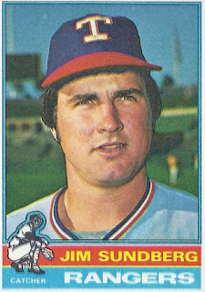
When I first got this card you can't imagine how pumped I was. The colors looked pretty cool to me at the time with the whole red, white, and blue theme going on. Then if you give it a better look you will see that it was for Jim Sundberg. We all know about Jim don't we?
(card from rangerscards blog)
If you didn't know it is the man pictured above. Jim played catcher in the majors for 16 years with four different teams. Starting his career as a Ranger, and ending it as a Ranger. Later he joined the Rangers front office, and a spot in my business card collection. Out of respect for Sundberg's privacy I blanked out his contact information which includes his cellphone number. That is the reason for the big white box with the black border.
Chicago White Sox
Falling under the category of logos that I'm glad to see long gone. I don't know how White Sox fans feel about this logo. I know that I associate it with some ugly uniforms though. You can't blame the logo as it had quite a run from 1976-1990. I still can't help, but think about those uniforms when I see this card. Even with that memory it is a welcomed card in the collection.
I always mention how some cards don't look as cool when they scan as they do in hand. This happens to be one of the cards that falls into that category. What you can't see is what looks to be a white border around the name is actually silver, and adds some great style to this card. While some baseball cards don't look as cool when we scan them to show off. Some of the business cards in the collection do the same thing. While it might not look like much here it is pretty cool with the silver around the SOX.


No comments:
Post a Comment