Cincinnati Reds
Not a bad design choice for the front of the card. You have the scalloped C, but with the Reds name inside. I personally think this might have been better represented by just going with the C, and leaving Reds out of it. The back much like with the Diamond Backs has the teams mission statement. I do appreciate how they did slightly jazz it up by throwing Mr. Red in there. This gave it a little more life than just the reds.com stuff.
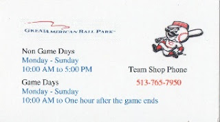
This is one of those cards where I think they nailed it. As a business card for the team this would be one of those cards I'd say should have went with the C. Looking it over you will notice that this card is for the team store. With Mr. Red being a merchandise type thing having him on the card gets a pass from me. I know they use him for many things, and he usually has his own cover in pocket schedules.Due to all this it works on the business card.
Milwaukee Brewers
This is one of those cards I acquired via trade with another collector. By the time I started this collection the mitt logo was a distant memory. Personally I like it better than the current logo, but that's just me. Cards like this are the reason I love this collection. You get to look back at the past through the logos. While I could do it other ways this is how I enjoy doing it.
Pittsburgh Pirates
While not a bad looking card. Would you believe that this is the worst of two cards from the Pirates? You can't not help, but like the whole saying on the back.
While not a huge change the black just adds something to the card. Out of the two I enjoy this card much more than the other for some unknown reason. Maybe I just like more color in my life than black, white, and yellow.


No comments:
Post a Comment