St. Louis Cardinals
Growing up as a kid I was a fan of both the Cubs, and the Cardinals second. My love for the Cardinals came from seeing logos such as the one on these cards. If you've followed me for awhile you know the Cubs love was due to them being on WGN all the time. Growing up I moved away from the Cubs, but still have the Cardinals love. That love is deep down as the Rockies, and Mariners are my teams now. The Cardinals were my very first MLB game, and a memory I still remember to this very day.
Visiting the grandparents, my grandfather who wasn't a baseball fan by any means. Took me out to watch a double-header against the Phillies. As A kid I was excited, and disappointed at the same time. The excitement was at seeing a team I loved, and seeing them in person. The disappointment was we were in the upper right field seats. At the time I was a kid, and didn't realize what a game cost, and that even getting to go was a huge deal. While it took a few years to really appreciate getting to watch those games. I will always remember seeing those two games. Sadly they lost both games, but I became an even bigger fan of the team just from watching those two games. I spent the rest of this visit driving them crazy watching Cardinal games every night. If their games had been on at home this would have converted me to a Cardinals fan for sure. They weren't so upon arriving back home it was back to rooting for the Cubs, but hoping the Cardinals did well.
Atlanta Braves
The Atlanta Braves cards fall under the usual classic look. As with quite a few teams we have seen, and will see throughout this project. It's the tried, and true look with the team logo in the upper right hand corner. While it works I wish teams would jazz them up like a few teams have. You are an MLB after all.
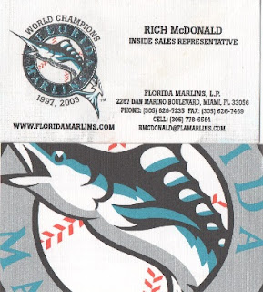
Miami Marlins
We can't do the Marlins without showing off the team they once were. While the team has changed to a more colorful logo, and name change from Florida to Miami. When it comes to business cards I for one was sad to see the change. These are some of the coolest business cards in the MLB if you ask me. Only the DiamondBacks, and Giants have cards this cool. What doesn't show in the scan is the fact that the area around Florida Marlins is silver embossed. Another cool thing that drives you crazy at the same time. They proudly put those two World Series Champions years everyone hates on the card front. From there the coolness factor gets even better as the back is part of the teams logo. The only thing that would have made these cards cooler is if there were multiple backs that created one big logo. This has been done by Red Robin, and looks awesome. While I don't have a complete puzzle from the Red Robin's it's a cool concept that would have been incredible here.
While to most teams this would be a sweet looking card. Compared to what they had with the Florida Marlins cards this is a step down if you ask me. You have to admit they did a great job with the new logo, and colors when it comes to the card. They did keep those two Championships on the front to continue rubbing it in with the new card. Another step down is the new card omitted the back, and is just the usual plain white. Overall it's still not that bad looking.
While to most teams this would be a sweet looking card. Compared to what they had with the Florida Marlins cards this is a step down if you ask me. You have to admit they did a great job with the new logo, and colors when it comes to the card. They did keep those two Championships on the front to continue rubbing it in with the new card. Another step down is the new card omitted the back, and is just the usual plain white. Overall it's still not that bad looking.


No comments:
Post a Comment