
Arizona Diamondbacks

Despite only being in existence since 1998. Arizona has gone through a couple changes that shows up in their business cards. The teams original colors were teal, purple, and copper. Looking at the cards this was obvious as like most teams their cards showcase these colors. My first cards from the team are the top cards which has the teams missions statement on the back. Not many teams do things across the back, but when they do more times than not its a good look.
The lower card came second, and not only changing to the normal sideways business card style. Below the logo you will notice that they added a 2001 World Champions line. Just below is the N.L. West Champions line for flair too. I like the way they cleaned up the look of the card, but added style at the same time. Sadly they didn't add anything to the card back.

In 2006 the D-Backs changed their team colors to Sedona Red, Sonoran Sand and black. Coming with the new colors was what I believe to be one of the top five best card designs for an MLB team. Not only did they return with the design on the card back. The new back looks tons better than the original by showcasing the cap logo instead of some mission statement. Throw in the entire logo area just says snake with the fangs coming off the teams name.
Colorado Rockies
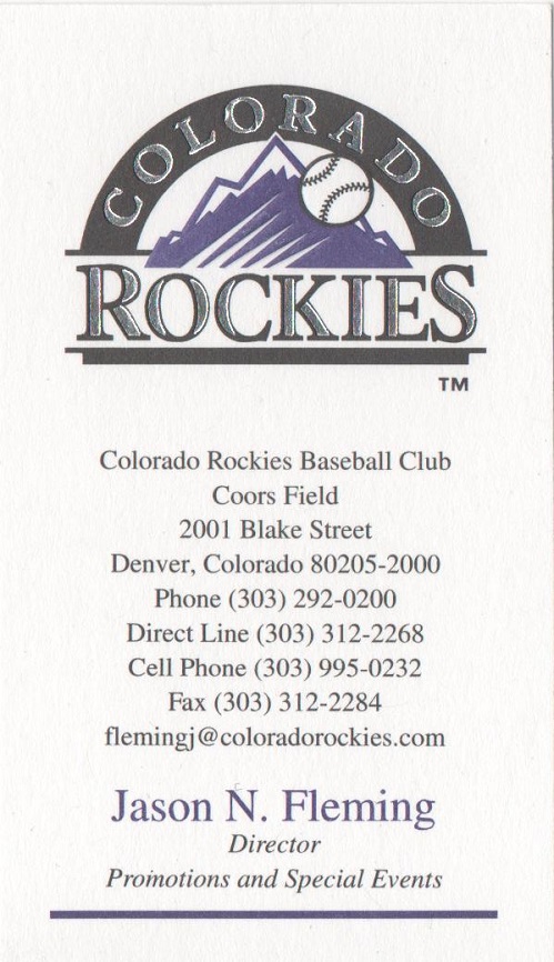
While I am a huge fan of the Rockies. I have to admit that their cards are a bit of disappointment. The card rates in the middle of the pack for design, and execution. While they do contain all the information you could want for contacting the team. To me the card just seems a little to cluttered. While I love the big logo across the top. You can't see in the scan the silver portion is a sweet looking shiny silver. The text is just to much, and something I'd love to see cleaned up just a little.
Los Angeles Dodgers

While not one of the flashiest, and a design used by a few teams. There is a reason teams go with this design. It works!! We aren't overwhelmed by information like the Rockies card. When you think of the logo choices that could have been used for this card. I think they did a great in picking the baseball instead of the LA. Sometimes little things like the logo choice can be what brings a card down, and the Dodgers didn't do that in my opinion.
No comments:
Post a Comment