New York Yankees
Another of your basic classic card designed business card. If anything atleast they put in the cursive font in the center to add a little flair. While I dislike the Yankees with a passion. It would have been a little cooler to have seen some mention of their World Series Championships on the back or an amount won across the bottom. They do so much at the stadium embracing their history, and accomplishments. Something along those lines would have been cool here.
Tampa Bay Rays
Not a bad looking card for what at the time was a fairly new team. While it could use work they hadn't been in the league long. It is a card they could improve on as getting the on field stuff together was still moving forward.
It didn't take long for Tampa Bay to put out a better business card. While going crazy they did put out a decent looking card for their second edition. Looking at this card there is one noticeable missing element. Other than seeing it in little letters as the teams website. Nowhere on the card does it say in big letters the name of the team. As a baseball team your name is a very important element to the card.
After changing names from the Devil Ray to just the Rays. The third attempt at a design ended with the best look to date. It's a great simple design that uses the teams colors quite nicely. The yellow ray burst on the side is a great touch that looks better in person than it does in the scan.
After changing names from the Devil Ray to just the Rays. The third attempt at a design ended with the best look to date. It's a great simple design that uses the teams colors quite nicely. The yellow ray burst on the side is a great touch that looks better in person than it does in the scan.
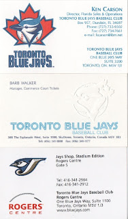
Toronto Blue Jays
Ending the run of Major League Baseball is the Blue Jays. There might not be a better team to end with than the Blue Jays. The three cards in the collection from the Blue Jays are very cool looking cards. I would rate them as a top five in MLB for their business cards. They have that classy look without over doing it. While not having any color on the logo in the middle card. It is indented on the card, and looks very cool in person. This seems to be the theme of today's cards.
Hopefully you have enjoyed this look through my entire collection of business cards for the MLB teams. I have enjoyed showing them, and even got to appreciate a few of them more than I did before starting these posts. Until doing these it was more about getting the card, and putting it in the page it belonged. Going through all these, and writing about them gave me a new appreciation for this collection. It has reminded me on why I started collecting the business cards from sports teams.
Within the next week or two weeks I will start with minor league teams. How this will look is still in the thinking stages currently. Right now I am planning on going through the leagues starting at Triple A teams, and working down through the various levels, and leagues. I do know so far that they won't be in alphabetical order, but in order by the way they are in my pages. I will also list them by town not team name as sometime towns have the team change names quite often.
The question marks are how many teams will get done during each post? Currently my feeling is to go with anywhere from a single team to three teams. Teams in the minors change affiliations, logos, and names so often that cards can go through a ton of changes. Due to all this doing three teams per post like I did for the MLB is just not something worth doing.
My other idea is I'm thinking about trying to just give some sort of information about the team rather than breaking down the cards look. Whenever possible I'll do the research on the affiliation, logo use, and name changes. There might be some teams where I comment a little, but my plan is to just give information on the team so we can all learn about new teams. If there is a way you'd like to see these done let me know as I'd love any ideas to make these better.
Finishing up I have one thing left to say. If you have been reading these posts stick around, and don't miss any future posts for the minor league teams. Some of these cards are simply amazing, and put the cards done by MLB to shame.


especially some of the minor league team names and logos--makes for some really neat biz cards
ReplyDelete